Pages

Friday, August 30, 2013

Class Cards and TS5 Deadline

These are two of the cards we did in our card class this week.


We had fun with metallic gelatos in this first card.  The book paper is from an 1880's Latin textbook I picked up at an antique store. I found out just how fragile this type of paper is when I tried to use a tape runner adhesive on the back.  It tore and started to roll up in my tape runner!  A glue stick worked best on it.  The background on the card base is a series of border stamps repeated.

For the bookmark and pocket, I used some retired Stampin' Up! paper and coordinating stamp.  They usually do a clearance in October.  I'll be sure to update on my blog when I see the clearance rack updated.  When SU! marks thing down, they are a steal.

Also, I wanted to mention that True Scrap 5 registration continues.  You can now use the discount code LUCKY50 to save $50 on the registration fee.  This is good through September.  However, there is one special expiring tomorrow August 31.  If you register by then you also get receive a complete set of replays from "True Scrap Young At Heart" valued at $97.  Here is the link for registration:

Click here to view more details

Thanks for stopping by today!  Hope you all have a safe holiday weekend.

Thursday, August 29, 2013

Making Chalkboard Embellishments

Chalkboard backgrounds and embellishments are very trendy in this fall's new scrapbook lines.  I had some Martha Stewart chalkboard paint left over from the 2P's Art class last spring and wanted to try making my own chalkboard embellishments.  These were cut with the Cricut and then dressed up with some stamps, watercolor crayons and colored pencils.  


Two of my favorite are these borders cut with just a regular scallop border punch before painting.  A paint pen and the the Signo White gel pen did the accenting.


You can use punches to cut out designs as well.


The how-to is all in the video:


These were a lot of fun to make and a bit addictive.  I want to use several of them on a layout soon.

Thanks for watching!

Tuesday, August 27, 2013

Embossed Vellum Butterfly 2 Page layout


My husband loves to visit one of the art and craft galleries in Asheville, NC.  He thinks it is better than a lot of museums.  They do have gorgeous things at all price points.  They are also very kind in allowing a little photography.

We went there to celebrate his birthday this year after going to the Folk Art center and then having lunch at Boston Market.  My parents were a bit perplexed that he picked a sort of fast food restaurant for his birthday dinner but he loves the place.  There are only 2 anywhere close to us and 'anywhere close' is about 60 miles one way or the other.  So it was a treat.

Mother had in mind her own treat and dropped massive hints about a bakery just short of the gallery so we stopped there for a treat on the way back.  I like how my Mother thinks :-)

For the page, I actually started this weeks ago and it just wasn't coming together so I set it aside and recently came back to it.  In the beginning it was to be a one page layout with 4 photos and the exhibit card.  It was just too crowded so I spread it out on two pages and added the squares with the vellum butterflies.


The video shares more about how these are created and applied.  A hot glue gun helps them hold their shape without anything showing through the wings.   There is also reverse stamping to get the butterfly on the right hand page to face the right way - in this case, to face left.

I just recently learned reverse stamping and it is so handy!

Watch at YouTube


Here's the sketch:
We had such a lovely day.  I'm glad I expanded this to a 2 pager.

Thanks for stopping by today!

Sunday, August 25, 2013

Color Webinar reminder

This month's Scrapinar (webinar) is on Color and is happening on Monday, the 26th at 2:00 Eastern.  If you are busy then, sign up anyway and watch the video after the event on Monday.  The video portion is usually about 20 minutes and it is all free!

Click here to view more details

I have a new page and project about the popular chalkboard elements for you this week along with the videos.  Unfortunately, I've been dealing with a cold all week and my voice isn't so hot.  I feel a lot better though.  So if I can get my voice back to normal to do the voiceovers, the videos will get posted.

Hope you are having a good weekend!

Friday, August 23, 2013

Holiday Cards 2013 - O Holy Night


It's time already.  Time to be thinking about Thanksgiving and Christmas.  I know that Halloween displays just went up and children are going back to school but you know the holidays will be here before you can blink.  So I've started my Christmas cards.

Most of the credit for the early start goes to Raisin Boat (raisinboat.com).  I subscribed to their stamp rental program a couple of months ago and have gotten 2 Christmas sets. Since I get the best deal if I only keep each set for 1 month and then return them, that gives me incentive to stamp, stamp, stamp and get those cards done or at least in process.

The card above will be for either my aunt or my mother's cards this year. The church looks so much like the one I grew up in.  The building is gone now and the congregation is in a newer building constructed when I was in high school.  It is roomy yet doesn't have the same charm.

 I did a dozen of these cards and then 2 more for the Operation Write Home box.  The video shares the complete process and a few tips on creating multiples faster including:

  • Color only a portion of the image.  For this one, I left the church white so I only colored the wreath, door and a few other areas.  That saved a ton of time.
  • Add interest with stickles and other embellishemnt AFTER you get your card complete.  That way if you run out of time, those extras can be left off and you still have a pretty card.
Here is the process video at YouTube:

I love renting seasonal stamps because a set like this would likely only be used for one season anyway.

Thanks for watching!

Thursday, August 22, 2013

True Scrap 5

One of my first on-line scrapbooking experiences was an on-line conference called Scrap-a-Faire.  This was hosted by Better Homes and Gardens Scrapbooks, Etc magazine.  They had 2 or three of these several years ago.  I loved it!  I learned so much and marveled at being able to take a conference without leaving home!  Unfortunately, the last one of these was years ago.

True Scrap hosted by Lain Ehmann and Layoutaday.com sounds similar.  While I have never participated in the entire event, the concept is the same.  Gather great instructors together to teach classes over a few days and have participants from all over the world join in.  You attend classes from your own sofa dressed in your pajamas if you want - all you need is your computer!  I have taken some individual classes from past True Scrap and found them very helpful.

This year's True Scrap has these fantastic instructors include Nichol Magourik, Jennifer Gallacher, and  Heidi Swapp plus 12 others.

For more information about this event happening in October:

Click here to view more details

Tomorrow I have a new card and video.  Thanks for stopping by!

Wednesday, August 21, 2013

Growth

I love leaves and trees.  The first stamp set I bought was Lovely as a Tree.  It has been followed by several other leaf and tree oriented sets.  My first punches were two leaf punches that I still use even though they are so hard to punch I have to put them on the floor and stomp on them.  So I guess I shouldn't be surprised that a tree and leaves would come to mind when looking for something for a new art piece.  This one is hanging now in my bathroom so I see it each morning.

I had 2 8x10 canvases on hand and have discovered I like a larger work area so I planned the piece to hang them one over the other.

I did the background and tree trunk 2 Sundays ago and finished up the rest this weekend.  In between we had been to Cheap Joe's Art Supply in Boone which is a bit like taking me to the candy store.  I was pretty good because I was so overwhelmed by all the stuff I didn't know quite what to buy settling on a few colors of transparent acrylic paint in different brands.  So I used some of the paints here on the leaves.


The bird was cut with the Cricut and I cut everything else by hand.  I did a pattern for the tree and then used several different papers to complete the trunk and branches.  The 'bark' is some modeling paste mixed with brown ink.  I so love that I get to use a lot of my ink refills and older acrylic paints in these pieces.  So many things underused or not used at all have been put to use.

Another thing from Cheap Joe's is a black Sharpie Paint Pen.  Lenny spotted them and wanted to try one for his pinball playfiends.  I think he is going to love it!  It does a very fine line over any surface including modge podge and doesn't smear at all.  He often has a lot of detail work to do in refurbishing a machine.

Making these pieces is still a learning process. For this one I think I would have picked a shorter saying or more likely used the same type of lettering for more words.  I was trying to do this with all stickers and papers cut out of books.  It is just a bit too busy and gets sort of lost.  The sentiment is a good one to read each day.  "Unless you try to do something beyond what you have already mastered, you will never grow." - Emerson

So I guess I'm growing :-)

Tuesday, August 20, 2013

Project Life without Pockets

Project Life is about capturing your every day life one photo per day.  All through the year, I've been taking photos trying for one a day.  I've captured them on traditional scrapbook layouts.  The Project Life system most attributed to Becky Higgins utilizes pocket style page protectors to hold photos, journaling cards and embellishment.


I wanted to give the concept a try without investing in a different style of page protector.  So I created 3 pages. This two page layout covers much of the month of July in 3"x4" photos as they might be tucked into pockets.  In my case, I just glued them to regular cardstock.  In the absence of a kit or journaling cards, I used pattern paper from the Lakeside 6x6 Paper pad by Pebbles to fill in my other spaces.


All the embellishment is contained within each paper or photo just as though they were tucked into pockets.

The third page below is similar except the embellishment goes diagonally along the page not confined to the photo or paper areas.


I much prefer the 3rd page.

Here is a video on how I did these pages:


And the sketch for the 3rd page:


The concept of Project Life is great.  If you've never taken 'a photo a day' I encourage you to give it a try.  There are days you forget or are just too busy but you will more than make up for it on other days.  You capture things you might ordinarily overlook and better yet, you get them into your scrapbook pages so you have that time capsule of everyday life for years down the road.

I'm sure if I'd used a kit and had the pocketed page protectors, my pages would have looked better to me.  However, this gave me a taste of applying the style and it isn't me.  My eye gets sort of lost on the two page layout trying to take it all in.  And you know I'm not shy about using all the real estate on my page!

I think the concept of Project Life, the kits and divided page protectors have simplified and speeded up scrapbooking for many people.  It has brought people into the hobby and brought people back to it.  That is a wonderful thing.  More memories are being captured which is a very good thing for sure.

So for me, this was an interesting experiment.  I know like traditional pages.  Everybody has their favorite format.  So whether we make mini books, traditional 12x12 pages, digital pages, Project Life pocketed pages, art journal or whatever, the important thing is that we are all capturing our lives.

Monday, August 19, 2013

Color Webinar

Hi!  Hope you had a crafty weekend.  I was very busy getting cards prepped for an upcoming card class and working on another art canvas I'll have posted soon.  I also completed a scrapbook page and video. Naturally as I worked on all these projects, I had to make some decisions about color.  I love choosing colors and playing with paints and inks.

So I'm looking forward to the next Scrapinar - a webinar related to scrapbooking or other papercrafting.  This one is on color and is being presented by Lori Sawaya.  It is called  Color Me Scrappy: Your Color Questions Answered.  She will be talking about choosing colors to enhance our photos, setting a mood on a layout through color, how to determine which colors "go," and more.

To join us on August 26...

Click here to view more details

Hope you will be able to make it.  Tomorrow I'll have a 3 page layout to share.  That's right, 3 pages!

Thursday, August 15, 2013

Imagine


I'm still having fun with mixed media.  I was inspired by this piece on Pinterest.  I loved the colors and I had the word "imagine" in metal that I'd bought years and years ago at a Scrapbooking store in Tennessee - I mean, probably 2005 or earlier - which is a really long time to hang onto something!  When I added it to this piece, it didn't quite show up enough so I went over it with silver liquid pearls which looks a bit like solder - messy solder.

I'm most pleased with these butterflies.  They started out as wood veneer pieces from Michaels.  First coat was a light application of white pigment ink.  Then I stamped them in gray with some definitions from Define Your Life set by Stampin' Up!  Finally I coated them heavily with Glossy Accents.  It is hard to see how glassy they look from the photos.

This piece is done on a board so it is currently propped up on an easel in my dining room.


The flowers were stamped and then colored with gelatos - a new obsession I'm sure to talk more about in coming posts.


This was a fun weekend project.  I started another one last weekend and have the background done.  Hoping to add the rest this weekend.  These are just a great relaxing creative outlet.  While I love scrapbooking so much and get a wonderful feeling of accomplishment and pride at capturing our memories, it is also fun and a bit challenging to just create something for true fun - something that really has no purpose.  It's sometimes hard for me to do something for no reason.   Thus I keep trying to figure out what I'm going to do with these pieces.  

Do you ever create something with no idea what you will do with it when it is done?

Thanks for stopping by!

Wednesday, August 14, 2013

Quick 3 Photo Page - sketch and video


These 3 4x6 photos are from Lenny's recent visit to Missouri for 'fishing.'  He came up with the title as a lot of what they do is really goofing around.  They seldom bring home any fish.

When he first proposed that title, I said, "That's a lot of f 's."  He looked at me funny but you understand. It really takes a bite out of a pack of Thickers.  When I explained it to him, he did suggest I cut the letters with my Cricut.  Darn, that man can't remember where he leave his glasses, wallet, phone, pretty much anything but he remembers why I wanted a Cricut 3 or 4 years ago?  "I can cut all my titles out of cardstock!"  Oh well, I do use my Cricut; it's just Thickers are really irresistible :-)


The page came together very quickly.  The banner goes with the nautical theme.  The cord is some old drapery cord.  I had about a 2 foot scrap that you really can't use for its intended purpose.  The cork embellishments are a mix of very old Pink Paislee and some very new Little Yellow Bicycle.


Here's the video at YouTube:


And here is the sketch:
The winner of the 1000 Subscriber's Giveaway is Maritza G.  I've contacted Maritza via YouTube.  Thanks so much to everyone for their wonderful comments.  I look forward to doing many more videos.

Thanks for watching today!

Tuesday, August 13, 2013

Perfect Pearls Tree Card

Karen and I experimented with my new tree stamp and some Perfect Pearls.  Here is one of the resulting cards:


I have to say this one wasn't going so well at first.  The original plan was to emboss the tree with my new Pewter embossing powder from Stampin' Up!  Only, I'd left the powder at home.  So we used a dark brown instead.  Then we embossed the words in white expecting them to show through the Perfect Pearls.  Well, they just didn't.  So we had to stamp and die cut our phrase and add it separately.  In between, we spent quite a bit of time blending colors.

I added a little clear Stickles to the tree branches.

The end result is a bit of a gloomy looking sky but we'll call it 'dramatic.'  How's that for rescuing a card?

Anyway, it is a beautiful stamp and a stamp press is definitely on my wish list.

If you haven't entered my 1000 Subscriber YouTube Giveaway, click here to enter.  Deadline is 6:00 p.m. Eastern today.

Saturday, August 10, 2013

School Notebook Covers


I thought it would be fun to use the same techniques I've used to cover spiral notebooks for myself for school notebooks.   Typically I put the paper under the spiral portion of the notebook as shown below.  For this one, I did a faster method of just taking the paper close to the spiral part.  Both are shown in the video below.

The stickers are from Hobby Lobby.  I had a young child in mind for this one.  The designer paper is an older piece from Pebbles.  A good medium weight paper is perfect for covering notebooks.  The really thin papers show their wear quickly and the very thick textured papers are tough to fold around to the inside.

This notebook below is for Dillon if he wants it.  Would a 7th grade boy like this?  I'm not sure.  He is growing up so fast and it is very hard for me to tell being quite a ways away.  Anyway, it is an example of one that uses designer papers mainly. It uses the Yearbook collection from Studio Calico and some 6x6 Simple Stories 24/7 papers which coordinated nicely.


For this one, I did the paper under the spiral and used a sticker for placing the name.  The letters are on there lightly so Jaime can remove them and pass it along to someone else if Dillon thinks it isn't 'cool' (or whatever the word is now.)  Boy, am I the one getting old?!


Here is the video at YouTube:


Have you entered my 1000 Subscriber Celebration Giveaway.  One randomly selected winner will get a special prize pack.  The video and instructions are here.  You have until Tuesday afternoon.

Thanks for stopping by!

Friday, August 9, 2013

Celebrating 1000 Subscribers!!!

Hi!  I've been promising you a little surprise.  There is a giveaway going on on my YouTube channel.  We are celebrating...


1000 YouTube Subscribers!

To enter the giveaway, you must leave a comment on this YouTube video.  The winner will be announced via another YouTube video next Wednesday.  I will only contact the winner requesting address info to send the prize to.  Comments on this post do not count as entries (though they are always welcome.)

(There has apparently been a YouTube scam going on where people get contacted say "You won! Please send your info..." when in fact you didn't so only give LisaEDesign your info if you see your YouTube name was picked.  This goes for anyone's giveaway.  It is a shame some people want to ruin things for everyone.  Anyway...)

International entries are welcome.  Thanks so much for all of your comments and support!  If there are any particular videos you would like to see, please let me know.  I love getting feedback.

Thursday, August 8, 2013

Cupcake, anyone?


Oh, to have something sweet!  This was one of our card class cards for July.  The stamp set is an old one from Hampton Arts though you could use any cupcake set.  The border is from Interlocking Borders by Lawn Fawn (on-sale right now along with everything else in the store at Two Peas in a Bucket).

Stickles and liquid pearls form the 'sprinkles.'  I used an enamel dot for the cherry on top.  The whipped cream is white fabric paint which look almost real!

Thanks for stopping by!  I have a surprise coming in a few days, hopefully by the weekend.

Wednesday, August 7, 2013

Reflection Stamping


I have always wanted to know how to create trees reflecting in the water so finally I chased down the instructions via a card I saw on Splitcoaststampers.  It is this blog post from Ruth M.

This is actually a simple technique and so dramatic.  For the background of the card, I masked off the bottom and then brayered and sponged on several colors for the sky.  I reversed the process to do the ground and water.  Then came the stamping of the trees from the old favorite, Lovely as a Tree stamp set from Stampin' Up!  Check out Ruth's post and you will see her pretty card using the same stamp and the instructions for reversing the trees.

Thanks for stopping by today!

Tuesday, August 6, 2013

And this little piggy went to...


Truffles for their wonderful chicken pot pie in wine sauce.  And he took along another little piggy who had crab cake rather than her usual meatloaf.  Both were sated and happy after a relaxing meal in the contemporary restaurant.  It wasn’t crowded since it was Memorial Day and the local business people who often dine there were absent.  And then one little piggy went off to the beach and one had a leisurely afternoon nap. Can you guess which one?

This is my favorite travel layout so far this year.  The papers from Echo Park's All About a Boy don't seem like they would fit a contemporary restaurant style but they do - at least the B sides do.  The woodgrain background is also from this collection.

The layout also took me back in time to my early days of scrapbooking in the 1990's when I didn't know there was such a hobby and thus all these great materials to go out and buy.  Back then, I used my photos, plain white cardstock from the office supply store, those sticky Hallmark albums, Microsoft Word, Power Point, and my trusty Epson dot matrix printer.   I depended on my computer to create titles from WordArt and images from clip art.

No where in my vast current stash did I have any food embellishments that fit this layout so I again turned to Power Point and clip art to find some food and a pig image.  I've added some additional color after printing and use Maya Road wood veneer frames.


More on how the page came together at YouTube:


Here is the sketch:


Thanks for watching!

Sunday, August 4, 2013

House Art Canvas


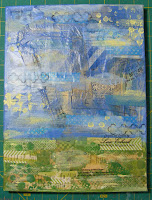
Remember this (right)?  I did this background in May when I was taking Christi Tomlinson's Behind the Art class.  Other projects took priority so I never finished it until this weekend.  I rewatched Christi's video on adding a house and flowers to finish it up.

The design sticks fairly close to her example. I positioned my house a bit high on the canvas so I added the walkway by painting in a backdrop and then using modeling paste and some Close to Cocoa ink over a circle stencil for the paving stones.

I wasn't sure about the flowers as they are out of proportion to the house, but they are one of my favorite parts.  I also used Christ's rub ons that I'd bought from 2P's.  For shading, I'm using oil pastels as they are very inexpensive.  The drawback is that they can smear so you have to be very careful if adding another coat of Modge Podge over the top. If I dabbed it on with a sponge brush, it seemed to be fine. She uses Faber Castell markers in the video and I'm not quite ready for the investment.


I was pleased with the end result particularly as it is one of my first pieces.  I made the background a bit busier than the example in an effort to try all kinds of things at once.  Patience is not my strong suit.  Although the idea is to have a lot of visual dimension with transparent paint, tissue paper, stamps and rub ons.


Also I learned some things that I really like the effect of (stamping in black) and things I don't (rub-ons in white at the end of a project).

I particularly like how you can use all kinds of things that might be gathering dust otherwise like old clothing pattern pieces, rub ons (I used some old Stampin' Up! ones as well), and acrylic paint.

For more info on Christi's class, check it out here.  "Behind the Art" is very comprehensive.

I'll have a new video up for you tomorrowTuesday and a special surprise coming later in the week...
Related Posts Plugin for WordPress, Blogger...