Pages

Wednesday, July 31, 2013

I Craft


Over the 4th, I took advantage of Karen's Big Shot and the scallop steel rule die to cut out a kit of chipboard and designer paper shapes.  I wasn't sure what I wanted to use them for, perhaps a mini album.

A couple of weekends ago, I started playing with the shapes and decided they were a bit small for an album.  I thought they would work as a banner.  I had seven chipboard shapes so I searched my mind for a seven letter word (Scrabble, anyone?) that would fit the creative process.  "Imagine" was my best one.  Finally, I thought out of the box a bit and used two words "I Craft."  In between, I put in a butterfly die cut also made with the Big Shot.  They are tied together with twine and are easy to flip over so I can flip some or all of them around to see the other side - sort of mix and match. Here is a version with some of the fronts and some of the backs.


On one side of the circles I have just the letter and some embellishment.  I have this box of large odd chipboard letters and this was a perfect project to use some of them up.

On the other side of each scallop circle is the letter cut from the Cricut and a word that uses that letter:

I - Inspire
C- Create
R - Remember
A - Art
F - Finish
T - Teach

The definitions for the first three are from Stampin' Up!'s Define Your Life stamp set.  The back side of the butterfly is a heart I'd already made when experimenting with Perfect Pearls.  It is a mixture of Perfect Pearls red and heavy gel.  It was just hanging around my worktable looking for somewhere to go :-)


When I first started the project I was obsessed with figuring out the perfect word and using the shapes in the best way.  Finally I relaxed and particularly enjoyed doing the back side of it.  Now the banner hangs over the attic door next to my worktable.

Thanks for stopping by today!

Tuesday, July 30, 2013

Birthday Tradition


Kermit may think "it isn't easy being green" and maybe it isn't.  But it's very easy to use green especially when you use a lot of it. I love green so it was the perfect color for this photo of my birthday dinner.  All of the paper is from Crate Paper's Acorn Avenue.

The page is for Two Peas CHA challenge to use 8 straight lines.  Some of my paper seams form lines as well as some Pink Paislee mistable borders.


Have you signed up for Lain Ehmann's 9 to 5 Scrapinar on Wednesday?  She will be sharing ideas for using office supplies on layouts.  Click here to sign up for this free event.  If you can't attend on Wednesday you will still get access to the video to watch later on:

Click here to view more details

Thanks for stopping by!

Sunday, July 28, 2013

Ombre and Layering (Process Video)


Two Peas 6th challenge for CHA is to use 6 layers with a photo or photos.  Layering is not my typical style so I thought this would be a fun one and it was.  The biggest challenge was limiting to six!  I didn't count the journaling as a layer.  After all, you have to have journaling.

Also, I haven't used the popular ombre technique on a scrapbook page so I wanted to try that, too.  To do the background, I brayered several different shades of blue and aqua Stampin' Up! inks on white cardstock.

For the layers, I used Crate Paper's the Pier 6x6 pad which has such beautiful colors and prints - with very little theme to them.  These papers can work with anything.  I dug through some very old stash for a transparency and a few stickers.

Without any of the letter 'o' I couldn't spell 'good' so I subbed stars for the letters.  The stars signify what a great job my stepdaughter, Jaime, has done keeping in shape.  She's my husband's good example these days.  I added some rock candy Stickles to give them a little zing.

Jaime's philosophy is lots of exercise so she can have some indulgences, thus the 'let them eat cake' sticker from Basic Grey's Paper Cottage collection.


Here's the video at YouTube:


Thanks for stopping by. Check out the challenges at Two Peas blog.

For more 6x6 layouts, my 6x6 Paper Pads to 12x12 Pages Scrapinar is still available for $7:
Click here to view more details


Friday, July 26, 2013

Odd Size Card and a love of office supplies

"For the Birds" from Stampin' Up! tops one of our cards from this month's card class.  We created a base for this 3" x 7" card with pattern paper pieces from a 6x6 pad from My Mind's Eye and some Washi strips.

Since this is an odd size card, we used the W R Memorykeepers envelope maker to create an envelope for the card.  One of the advantages about making your own envelope is being able to stamp a clean image before assembling the envelope.

Do you have crafty plans this weekend?

I know I want to finish going through the CHA videos at Two Peas and doing some of their challenges.

Another free video opportunity is coming up.  Do you like office supplies?  I used to think I was a bit weird for loving office supplies but have sense learned that lots of scrapbookers like them.  So I'm not alone.

Lain Ehmann is presenting a Scrapinar on using office supplies in your scrapbooking on July 31!  To attend on the 31st or watch the video later, sign up here:

Click here to view more details

I'm signed up.  Hope to see you there!


Wednesday, July 24, 2013

Old Techniques and New Products (CHA Links)


No matter how much we love to shop for our papercrafting products, we can always find some fun in older products and techniques.  This card uses the brayer which has been around forever but is new to me.  Karen and I each made one of these using this excellent video from Tami White as a guide.  We followed the instructions closely so this is definitely a CASE card.

Here is a link to Karen's card. She does a great job explaining the steps we used to create it.  My first effort with the brayer at home had been less than successful so I was delighted with how pretty this turned out and it wasn't very messy at all.  Messy was part of the 'less than successful' first effort I'd made.  Many of the inks are older Stampin' Up! colors - really just ink and cardstock so nothing fancy for materials.

On the other hand, I love to play with new products.  Plenty are being released for this summer's CHA - Craft and Hobby Association - show in Las Vegas.  Manufacturers have been posting some previews on their blogs for the last few days.  Two Peas has a big event going on you can find here.  They have challenges and videos of new products.  The videos are excellent as they are clear and feature full collections in many cases.

I've been putting a few things into two Pinterest boards.  I first started this one for CHA as I happened across things on blogs over the last few days.  Now I've also added this one as part of a Two Peas challenge to match up current product with new releases.  It's a clever idea so you can be thinking of what you have already as you are planning what you want to buy.

The thing I'm most noticing about CHA this time are the number of bright colorful all purpose collections.  Summer CHA is often about the holiday collections and they are certainly there.  I'm delighted though that there is something beyond Christmas and Halloween to look at.  On the other hand, I bought so much paper in the spring.  Oh, well as long as I'm just pinning and not paying...

Hope you have a great day!

Tuesday, July 23, 2013

Watercolors and Gelatos - Process Video


It's really all about the trees.

That is what I think about when I'm explaining to someone why we like to go to Hilton Head Island.  Everyone here has 'their beach.'  When I was in my 20's that was Myrtle Beach.  The first year Lenny and I started dating, we went to Hilton Head and fell in love - with the island, we were already in love with each other :-)

To me, what makes it special is that the minute you step off the beach almost anywhere on the island, you are in the shade.  There are trees everywhere.  It must be a nightmare to build something on the island for all the trees you have to preserve.  Those trees and all the landscaping around the island make it so beautiful, cooler and less commercial looking.  There are plenty of commercial parts but they do their best to make them attractive.  There are lots of rules about signage and I think it takes a permit to cut down a tree even if it is on your own property.   They have a Red Roof Inn that doesn't actually have a red roof but a rust color one because it was thought the bright red wouldn't look as natural.

So that is one of the things we love.  The photo on the bottom of the layout was taken just after we walked off the beach where we stay. The one above was out biking very near the ocean.

For the layout, I'm using a new stamp from Stampabilities that is so large it won't fit on my largest acrylic block!  I've embossed it and then used watercolors and gelatos to add the background.  I love watercolors as they are very forgiving as seen in the video.  You can just keep adding layers or wipe off some color if you don't like what you have done.


The leaves challenged a bit as I tried some larger ones first.  In the end, I came back to a very old and very well used oak leaf punch.

Here's the video at YouTube:


I don't have a sketch for this one.

The 6x6 class is still available for replay:

Click here to view more details

Thanks for stopping by!  Have you seen anything on CHA you want yet?  I'll be posting some favorites so far tomorrow.

Monday, July 22, 2013

Favorite Card and Easel Card


Hi!  Hope you had a wonderful weekend.  We enjoyed a slight cool down here.

This is my favorite card from our scrapbooking/cardmaking weekend during the 4th.  I love this die cut border.  It is cut from Pear Pizzazz cardstock and then I used markers and white gel pen to add some color to the flowers and leaves.

I also cut extras of the clouds from Karen's cloud die because I often use them on cards and scrapbook pages.


I've tried easel cards before but this time I followed the real instructions that Karen had printed out.  The stamp set is "For the Birds" from Stampin' Up! I've used some Pinwheel paper from Lily Bee.

Thanks for visiting today!

Thursday, July 18, 2013

So Not Fishing


I'm back to Project Life or Project 365 with a two page layout for the 2 weeks in June I was NOT fishing.  My husband was fishing, visiting family, and looking after his grandson - sometimes all at once.  I had a blissful two weeks of complete peace, quiet, clean floors, less cooking and little laundry!  (I missed him...I really did.)

While I was home most of the time, I did get out some most every day.  Sometimes it was just for a walk or a quick trip to the grocery store.  I also had several visits with friends and family.  I took in the local farmer's market.  Here at home, I did some extra cleaning, reorganized all my stamping up ink and papers, and did lots of projects many still to come on the blog.

For this layout, I started with 2 sheets of white cardstock which seemed so simple.  In the video, you find out at the end that this almost turned into a disaster.  I typically use either Hobby Lobby brand or Stampin' Up! cardstock.  This was Bazzill and had a branding strip.  Does your cardstock have a branding strip?  Anyway, I learned a very important lesson about measuring.

The female figure is from a stencil also from Hobby Lobby that I got on the clearance rack for 64 cents!  I love how she turned out.  She is paired with another stamp and some wood veneer I got at Archivers on my recent trip east.

Paper triangles are from the 6x6 Paper pad from Amy Tan's Ready Set Go.  The colors were perfect for the photos and were very bright.  To soften the page some, I also used the brayer and Stampin' Up!'s Baja Breeze ink - my favorite.  This was my favorite part of the page.


All the wood veneer pieces from the Carte Postale collection by Basic Grey.  These little frames are perfect for the 2" square photos.


Here's the video at YouTube


And here is the sketch:


For more pages using 6x6 paper pads, check out the 6x6 Pads on 12x12 Pages Scrapinar now available for replay!

Click here to view more details

Thank for visiting today!

Wednesday, July 17, 2013

Cantaloupe, Brown Sugar and Wisteria


Sounds like a weird recipe doesn't it?  Well, it would be if we were talking about the fruit, the sweetener and the flower.  Instead, these are the colors for this week's Splitcoaststampers color challenge.

The challenge was super easy for me this week as I had already embossed this piece of Crisp Cantaloupe Coredinations cardstock and stamped the image when I was visiting Karen over the 4th.  She is so generous with her tools and supplies and I love using the Big Shot and new stamps while I'm there.  I just had to add color and matting.

The stamp set is Cherish Friendship.  I colored the chair with markers and watercolor crayons.  To get the twine colored, I used a Darlene DeVries technique.  Add ink to your craft mat, spray with water and then roll some white twine around in the mixture until dyed.  The 'dessert' this week is to use a clip so my clip is from Tim Holtz.


I also did the coloring and assembly for this card I stamped and embossed at Karen's.  I'm not sure what stamp set this image is from but I really like it. It is delicate but not so small that I can't control the blender pen.  The blue cardstock is Island Indigo, now part of the Regals collection.

Speaking of all these great colors, yesterday I posted about my updated cardstock deck.  I had to update as Stampin' Up! has added some new colors and brought back a lot of older In Colors.  Here's the post.

Thanks for stopping by!  I'll be back tomorrow or Friday with a new scrapbook page and video.

Tuesday, July 16, 2013

Cardstock Deck

A couple of years ago I did this post about my Stampin' Up! cardstock deck.  It was for the longest time, my most viewed post.  I love the cardstock deck and use it almost daily.  While I've talked about it on the blog and posted about it on Splitcoaststampers, I'd never done a video until now.

Here is the latest card stock deck.

My old one had two versions:  One by color like this one shown here and another by Stampin' Up! color family.  I almost never use the one by color family so I skipped it altogether this time around.

I use the deck to help me find a good color match for designer paper.  It works like a paint deck.  You just hold it up to whatever you are trying to match and choose the closest color.  So I have all the reds on one page from darkest to lightest, the yellows on another page and so on with the neutrals together on the last page.

Since I use both Papertrey Ink and Stampin' Up!, there are a lot of colors here.  I also keep several of Stampin' Up!'s retired colors as long as I have some of the paper left in my paper drawers.  These papers come in very handy for cutting letters on the Cricut to match a page or for other small details.  The color Riding Hood Red that Stampin' Up! just dropped is incredibly popular with other paper manufacturers.  That color almost always is the match for red so I'll keep it in the deck as long as I have some.

If you would like to make your own deck, here are the file you can download.  They are in Microsoft Word format.  You can add or change color names to suit the cardstock you use.  This would work for Bazzill or any other cardstock.

Stampin' Up! Cardstock Deck - contains current and some retired SU! colors
Stampin' Up! and Papertrey Ink Deck - contains current SU!, most current Papertrey Ink and some retired SU! colors

The video also contains a 'computer-free' option if you want to create your own deck and write in the names. The only thing you really need is some plain white cardstock and grommets to hold everything together.

Watch at YouTube


If you have questions, please leave a comment or send an e-mail.  Thanks for watching!

Monday, July 15, 2013

Calorie-free Gelatos


On my recent trip, I bought a lot of scrapbooking supplies.  My only regret was a package of Perfect Pearls.  I'm really not using the ones I have so I vowed to do something about it.  At home, I made a list the other day of products and tools I haven't used much or at all.  What surprised me the most was that the majority of my items were in the rolling drawer bin right beside of my chair!  Why am I not using my Perfect Pearls more or why haven't I even opened that grunge board I bought 2 years ago?  It is puzzling when I haven't tried something at all.  I'm not a person who can buy a new dress and hang it in the closet.

Faber Castell Gelatos were one of the things I hadn't used at all.  I bought them when I was taking an art class of Christi Tomlinsons.  Before I could completely finish a class project, I had the opportunity to teach the 6x6 Scrapinar so my artsy stuff mostly got put on hold and the gelatos stayed in their packaging - until last week.

I watched some YouTube videos to see how to use these colorful tubes on cards.  They go on like lipstick and give gorgeous color.  Mine are the metallics so they have a shine as well.  Here are my favorite videos so far:  How to use Faber Castell Gelatos by Darlene DeVries  and Emboss Resist using Faber Castell Gelatos by injoystampin. 

The card on top is the emboss relief with gelatos.  The paper is some very, very old book paper from a Latin textbook I bought at an antique mall when I was looking for class supplies.  Oh, there is another thing I can check off my list!


The card below is based on Darlene Devries using her technique for the flowers. I also used the gelatos for my background as well.


One thing I really love is that these dry permanent so the color and the shine don't wear off.

So I've been having some fun using great new products. Oh and that 6x6 class I taught is now available for replay for $7 via the link here or on the right side of my blog page.

Click here to view more details


Thanks for visiting!

Friday, July 12, 2013

4th of July past - Process Video


I mentioned the other day that the only place I would travel for the 4th for many, many years was to Gatlinburg, TN.  It is less than 4 hours from here and once you get there, if you are staying in a hotel or condo near downtown, you just park and walk everywhere.

These photos were taken about 1990.  In the video I commented that I really didn't want to cover up my legs with the Thickers.  That sounds vain but hey, will I ever have mid-20's legs again?  Don't think so. Actually, I now have a rather unattractive scar on my right knee from a fall about 4 years ago.  So I'll preserve these photos the best I can :-)

Here is the journaling:
So what if there is a ton of traffic and people 4 deep on the sidewalks? It is the crowd that adds vibrancy to Gatlinburg.  For years, this was the only place I would travel on the 4th because I knew I could park and walk everywhere.  I was never afraid even when there was no one I knew with me.  The light display just gets bigger each year and they have the country’s first Independence day parade at 12:01 a.m. July 4.  I went down one year and watched from the corner of Baskins Creek Road and the Parkway.  Memories are everywhere – the flame in the Village fountain, the smell of chocolate piped out into the street from the candy kitchens, the heat of the day still radiating off the sidewalk, the quick twist to avoid being caught between people filing up and down the streets and ketches in the shops that have been there since my childhood.  This is summer to me.

I went to Gatlinburg at least once a year usually more often from early childhood until my early 40's. We haven't gone in awhile and I miss it.  Perhaps we will get there this fall.

For the page, I embossed some of the fireworks in American Crafts Zing silver powder and some in white.  To get the red spots, I mixed some Mister Huey mist with Perfect Pearls.  It darkened the color and also gave a nice shine.  It was an experiment that paid off.  I really wasn't sure about whole thing but was very pleased with the end result.


The paper for the banners is from a My Mind's Eye 6x6 pad I picked up on sale at Two Peas recently.  They are doing another sale right now on everything in the store!  I'm sitting this one out as I've put myself on an adhesive and photo processing only diet for a few weeks.  We'll see how that goes.  I think scrapbook shopping restrictions are harder than food ones!

Watch at YouTube


I didn't do a sketch for this one as I sort of worked it out as I went along.

Thanks for stopping by!

Thursday, July 11, 2013

Christmas in July clallenge


A few days ago, I shared my first card with Raisin Boat rental stamps.  Here is card from another set called Elf Express.  They have several sets with these adorable little elves.  One challenge I've had with their stamps is finding a black ink that stamps well and doesn't bleed with my water-based markers and watercolor crayons. I experimented at Karen's with Momento and Ranger Archival ink pads she had.  The Archival Ink did the best job overall as it is permanent and doesn't bleed when water is applied.  I wish the Momento had worked and it did for Stampin' Up! markers on SU! cardstock.  However, it ran on watercolor paper with watercolor products.  It certainly gives a fantastic impression though.

Anyway, I stamped a few of these and now I think I'll do some more.  This did not take nearly as long to color as I'd anticipated.  I'm not a really fussy color-er.  If I stay between the lines, I'm happy.


The ladies at Raisin Boat use a product called Liquid Applique for their 'snow.'  Jo Ann's carries it on-line but not in the store.  At Michaels they sold me a puffy white paint (from back in the t-shirt section) that works great and is very inexpensive.

The little trees on the right are also part of the set as is the greeting.  I added some Versamark and clear embossed the 2nd layer of gumball green cardstock behind the image.

The card came together quickly as I was following the sketch and color challenges this week at Splitcoaststampers.   Mary, our hostess, chose the colors Gumball Green, Cherry Cobbler, and Crumb Cake (kraft).   Dessert option was a Christmas themed card.  That was easy as I really wanted to try out this fun set - Elf Express.

Thanks for visiting!  To see my first Raisin Boat cards, click on this post.

Tuesday, July 9, 2013

Shelter Cove Art Show


When we check in on Hilton Head Island, we stock up on all the local 'things to do' publications.  One advertised an art show going on that weekend (Memorial Day) at Shelter Cove Harbor only a mile from where we were staying.  We decided to bike up there the next morning and browse.

At first, I was a bit disappointed as there were only 5 or 6 booths by the harbor, then I turned around and saw a long line of tents back in the trees.  There are trees everywhere on Hilton Head so you really do have to look for stuff.  We were soon impressed by the range and intricacy of many of the crafts.  It had been awhile since we had been to this type of show and I'm either behind on what's trendy or these were some very high end artisans.  Metal works were common as well as etchings, unusual composition of paintings and even artwork made from humanely grown butterflies.  (I'm not sure what is humane about turning a butterfly into a piece of art, but they were pretty.  I think the butterflies have a normal lifespan and are not killed to make the art.)

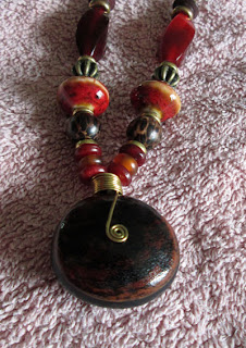
We browsed for a long time and I did buy a necklace made of sea beans.  A sea bean is a large brown object that looks like a piece of wood.  It comes from pods off trees in rain forests that wash down through the streams into the ocean.  After a few years drifting about in salt water, these turn up on a beach somewhere.  Mine was found in Liberia.  The husband of the couple selling them travels extensively for business in the shipping industry and found them.  Here's my necklace using a 'hamburger' style bean with a contrasting shade around the middle.


For the page, I created a photo collage in Photoshop Elements.  A few tips on creating a photo collage:

- Select the photos you want to use and have them all open.
- Create a new document in the size you will print.  I used an 8"x10" even though I didn't plan to completely fill the space.  Set the size to 300 dpi.
- Choose your main photo and crop to the desired finished size at 300 dpi.
- Drag the main photo onto your blank new document and position.
- Then choose another photo to line up beside of it or below or above and crop that photo using the measurements from the first photo as a guide.  For example, if my main photo is the one in the upper left corner and it is 4" wide,  I'll choose the photo below it and make it 4" wide and whatever height I want.
- Then drag that photo in place on your larger document.
- Continue selecting and cropping photo building out from one point.
- Save your project as a .jpg file.

This is just one way to go about a photo collage.

I had more journaling than expected so I tucked it behind the collage.  The video goes over creating a pocket from a regular mailing envelope:


I'm most pleased with how these flowers came out using designer paper from a 6x6 pad, ink refills and some glazing medium:


So here's the video at YouTube:


We are thinking of going to Belle Chere in Asheville, NC which is a giant art festival each July.  Has anyone ever been?

Thanks for stopping by today!

Monday, July 8, 2013

Craft, shop, craft, craft, craft


I broke one of my long time vows this past weekend.  I spent the 4th of July somewhere other than home (which is the most typical) or Gatlinburg, TN.  I went to visit my friend Karen in Greenville, NC and had a marvelous time visiting and crafting!

When I was growing up, my parents had a retail business and always closed for the 4th of July week because that was when everyone in this area was off.  It is still a common practice among small businesses and factories.  So that is when we traveled.  I've been to Disney World on the day of the 4th, Amish country in Pennsylvania,  Washington, D.C. and various relatives from Seattle to Florida by plane or crowded highways.  By the time I was 21 and moving out, I'd had enough.  I vowed the only place I would go was Gatlinburg, if that, because I could park and walk everywhere.  Except for one business trip requiring a 4th of July flight, I've held up the vow.  I'm glad though that it broke this year as we had such fun.  We did very traditional 4th of July activities that I'm sure will be scrapbooked later on.

For now, here are a couple of the cards I made using Karen's Big Shot and embossing folders.  The paper for the card is Stampin' Up!'s new Baked Brown Sugar color in their Coredinations cardstock. Coredinations has a textured finish and a core of a lighter shade of the top color.  You can emboss it and then sand the surface for a pretty effect.  As far as I can tell, that is the main technique for this paper.  So I would recommend it if you have an embossing system.  If not, it is a bit overpriced.  And why they offer this in only 12x12 when that is the primary feature requiring you to trim the paper down, I'm not quite sure.  Maybe there is something, I'm missing here.

Anyway, it makes a nice finish and the new In Colors are all lovely. I've covered them at the beginning of this shopping video along with the new Smokey Slate as it compares to the old, much missed, Going Gray.

For this card, I used white craft ink on the embossing folder before running it through with a piece of Crumb Cake (kraft) cardstock.


Now a trip down east, would not be complete without a stop at Archivers and the rounds of Michaels, JoAnn's (which we don't have near me) and AC Moore.  So I put together a little shopping video that includes a bit of Stampin' Up! at the beginning.

Watch at YouTube


This will be the last shopping video for awhile as I've definitely exhausted my budget in the last few weeks.  CHA which showcases the new scrapbooking offerings will be in late July and lots of new products will surely be available soon after.  Maybe my pocketbook will have recovered by August :-)

There will be lots of other videos though.  So come back soon for another sketch and scrapbook page video this week.

Wednesday, July 3, 2013

Raisin Boat Stamp - card and video

A few days ago I shared cards I made using a class taught my the ladies who run Raisin Boat stamps.  This was the first I'd heard of the company and their unique concept.  They let you rent stamps.  What a wonderful idea!  It is like Netflix.  You can sign up for a program - depending on how many sets you want per month.  You create a pick list of sets and they ship them out in order of what is on your list and availability.  When you are done, you return them in a self-addressed, postage paid envelope.  The next set(s) are shipped according to how many sets you get each month.

I'm trying it out and have my first two sets.  I think I signed up on a Tuesday and had the sets on Friday. Super fast!  The clear stamps are a very good quality, work well with Stampin' Up! and Distress Ink.  These are my first two cards.

Both were made with the Stunning Silhouettes set.  Many of their other sets are outline stamps to color.  I loved this one because I could do a lot of things with it. For the first card, I stamped and embossed.

For this card, I stamped and stamped off in two colors of purple - Elegant Eggplant and Wisteria Wonder:


Here is the video for the first card at YouTube:


My 2nd Raisin Boat set is an adorable Christmas one.  I'll have some cards up with it before the end of the month.

I won't have a scrapbook video this week.  I'll be back with one next week.  Hope you have a wonderful 4th of July holiday!

Tuesday, July 2, 2013

Find Your Voice - Free Class

Happy Tuesday!  And a slightly belated Happy Canada Day to my Canadian readers.  Hope you had a wonderful holiday weekend.  And special thanks to Tracy for sharing a link to this free on-line class:


The class just started last week so there is plenty of time to get in on this.  During the first week, one of the questions we were asked was what our storytelling goals were and how they fit in with creative pursuits.   So, I'll answer that here:

I can be a slow scrapbooker and one of the reasons is that I often put off writing the journaling.  It used to be that was the first thing I did back when I really had no supplies and just scrapbooked with photos, what I could type and print on my dot matrix printer and usually a Word Art title.  Now I get busy with design, planning a space for journaling, considering what I want to cover but not actually writing it - until the last minute.  I like to tell myself this is because it is inconvenient to bring my laptop upstairs and print.  Really?  It's that hard to carry a laptop up the stairs and hook it up to a printer. No, it isn't.  I'm just procrastinating.

It isn't only journaling.  Last week I needed to send a Thank You note.  I created a pretty card and wrote the first line of the note - something like "Thank you very much for..." and that was as far as I got for 2 days!  It just sat there waiting on me to find the right words.  I addressed the envelope.  I reread that first line a few times. Well, I finally wrote something down and mailed it off.  Still, I wasn't all that happy with what I wrote.  It was wooden and trite.  I have a particularly hard time when handwriting.  I do much better typing as I can make changes, yet I still put things off.

Scrapbook journaling often becomes the What, Where, When type and not really capturing all an event meant to us.   So I'd like to say more - not necessarily with more words and say it with less stress.

That is what I want to learn this summer.

I've noticed a couple of stamping and cardmaking classes advertised on various blogs. Are you taking any classes this summer?
Related Posts Plugin for WordPress, Blogger...