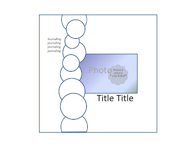
Small paper pads, either 6" square or 8" square, are really popular. They are fairly inexpensive ways to get all the great patterns from one collection. I did this sketch as a way to use my October Afternoon paper pads on a 12x12 layout. Typically I love to place elements edge to edge. In this case I used circles rather than my traditional paper strips. In the second layout, I cut squares and arranged in this argyle pattern.

The first video goes through the first layout step-by-step and briefly addresses how to flip the sketch for the second layout. It also shows how to use Creative Memories cutters though you could use any circle cutters.
Watch at YouTube
The second video is the stitched argyle pattern.
Watch at YouTube
Here is a link to the tutorial on creating your own shimmer paint similar to what I used on the letters by Rosanne (roxycar11):
Watch at YouTube
Hope you will grab a mini paper pad or some scraps and join me for an easy layout. If you would like to leave your blog address in the comments, I'd love to see what you have created.
Thanks for watching!
(Ingredients for both layouts are listed at the end of the first video.)


great layouts! thanks for the videos :)
ReplyDeleteSuch beautiful pages...and great ways to use those paper pads! Thanks for sharing!
ReplyDeleteLove this! Love the layering of the circles!
ReplyDeleteWow! Love both layouts but especially the 1st - love layouts with circles!
ReplyDeleteGreat idea using paper pads. I have a bunch of Stampin Up 6 x 6 pads and I forget to use them a lot. I really like your layouts also!
ReplyDeleteVery cute pages!
ReplyDeleteLove the line of circles!
ReplyDeleteGreat ideas! I love this! Love Penny Scrap-aholic.blogspot.com
ReplyDeleteGreat little tutorial! I love the smaller paper pads and use them mostly for scrapping, since I don't make that many cards. Love the reduced size of the patterns.
ReplyDeleteWonderful pages and videos, Lisa! I love the layered circles and the argyle stitching. I really need to try that technique.
ReplyDeleteBoth layouts are great! I love that you showed both layouts from the same sketch.
ReplyDeleteYou really put a lot of work into these layouts.