Pages

Saturday, October 31, 2009

A Quick Note of Thanks

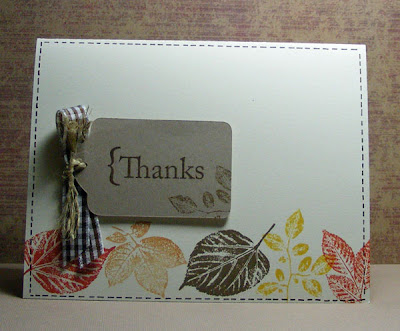
This card answers two challenges from Two Peas in a Bucket. The design is based on a Finally Friday sketch and it is an Autumn/Gratitude themed card for this month's A Year in Cards - both videos by Kristina Werner. http://www.kwernerdesign.com/blog/
.
Since I don't have a tag punch, I cut the tag with my Cricut and the Tags, Bags, Boxes and More cartridge I just got in on Friday. The rest was all easy stamping mostly in Stampin' Up! In Colors. The faux stitching lines were done with a journaling pen. I did 4 of these and they went really quick.
.
Ingredients: Stamps: Summer Leaves by Stampendous, Make it Count for greeting by Stampin' Up!
Ink all by SU!: Crushed Curry, Soft Suede, More Mustard and Dusty Durango, Basic Brown journaling pen
Ribbon by Paper Studio
Paper: Kraft and Very Vanilla cardstock by SU!

Friday, October 30, 2009

A Purple Holiday

As I'm working on this year's holiday cards, I've been pulling out some from previous years. Some of the trends I've spotted: I love snowflakes - maybe because we so seldom get the real thing. I love using shades of purple and lavendar on cards.

Last Christmas I made several of this card by printing the greeting on ivory paper and then stamping the snowflakes in various shades mostly from the Soft Subtles family of inks from Stampin' Up! The purple background paper is stamped in Versamark with a swirly snowflake holiday design from Indakindado to add a little depth to the card.


I also love to use sheer florist ribbon. If you use wire ribbon, be sure to trim after you tie your bow to get those little wires that stick out of the ends. This type of ribbon is inexpensive and adds a subtle layer to a card.


Ingredients: Stamps: snowflakes from Stampin' Up!, Winter Trails from Inkadindado
Ink: Stampin' Up! and Versamark
Paper and ribbon: sources unknown.

Thursday, October 29, 2009

New Gadgets

There are three new gadgets on my blog. On the right side of the screen you will find new lists called: Places to Learn, Places to Shop and Blogs I read. I've kept the lists discerning for now. There are more of these I visit and I'll probably add to the lists over time.

Places to Shop is pretty self-explanatory. While I often learn from bloggers, Places to Learn is mostly sites who have on-line training as a big part of what they offer.

Blogs I read is just some of the places I go regularly. Some of the best stuff can be found by going to your favorite blogs and seeing what each blogger likes. I always mean to do more of it myself.

This weekend I'm going to pick one blog I like, follow a link from it to another, from that to another and so on for about 20 links and see where I end up. Give it a try and see where in the world (literally) that you land.

Tuesday, October 27, 2009

TIPsy Tuesday - Cricut Resources


It's already been an adventuresome week around here and it is only Tuesday! So today's tip will be references to other people's great tips. Cheating, I know but I hope it helps you as much as it did me when considering a cutting system.

I decided to purchase the Cricut Expression over other cutting systems because of the size of the cutting area (up to 12x24"), the ability to resize letters and shapes from 1/4" to 11 1/2", the ability to cut thin chipboard. Ideally I would have liked to cut heavier chipboard but the other advantages were more important to me.

Another strong factor in the Cricut's favor was the 3rd party software - Sure Cuts A Lot or SCAL from Craft Edge. You can (and I am) of course using cartridges to cut designs on the Cricut. However, I didn't want to have to purchase so many font cartridges to get a variety of fonts for my scrapbook pages. With SCAL, I can use any TrueType font on my computer including Dingbats and cut letters, even welded words on my Cricut. Dingbats are fonts like Wingdings, Webdings and countless other ones you can download from the internet that contain shapes. These shapes can be enlarged using SCAL and then sent to cut on the Cricut. I can also draw images in a drawing program like Photoshop Elements and have SCAL trace the image and cut it with my Cricut. I can arrange multiple images and cut them together. Between some basic cartridges and SCAL, I have a HUGE array of items I can customize and cut!


In the layout here, I used the Plantin Schoolbook cartridge that came with the Cricut to cut the tag and the letters "Riverbend." This is called Endcaps. I also cut Park with this cartridge. For the other letters and the @ symbol, I used Sure Cuts a Lot and the font Andy. All the paper here is Stampin' Up! cardstock. I have my speed, pressure and cutting depth at 4.


Before purchasing my Cricut, I watched several videos on the use of SCAL and the basics of the Cricut. These helped not only with the purcasing decision but in getting me up and running - Fast! I truly went from a boxed Cricut to making my first cut with a cartridge in 15 minutes! (I had a hairstylist appointment and had to rush :-)


Here are the resources I used:

For learning the basics of the Cricut: http://www.cricut.com/ under Education, Videos, Intro. This is a long video that can't be fast forwarded so have about an hour free when you watch it.

robynstamps channel on Youtube - http://www.youtube.com/user/robynstamps#g/a

Numerous videos from the basics to specific projects. Her basics start at Episode 72.

Sure Cuts a Lot software can be purchased via their website at http://www.craftedge.com/. You can download a trial version which is recommended to be sure the software works with the firmware (preloaded software that makes your Cricut work) before you purchase. It is very simple software to learn. I've only had one question and tech support responded in less than an hour to my e-mail. There are also Youtube videos on this software as well to give you an idea of how it works.
The one other thing I did was read various opinions on message boards such as Splitcoaststampers forum and at Two Peas in a Bucket. I was looking for how happy people were with the Cricut versus the Silhouette or the Big Shot.

Hope all this helps anyone considering the purchase of a Cricut. It is an investment but so far, I'm really happy with mine.

Sunday, October 25, 2009

Happy Halloween Card

Attention blog readers! This will probably be your only chance to see a Halloween card here. I'm not a Halloween person. Although I used to love to get dressed up when I worked in an office and we were allowed to do that. At home, we have only had trick or treaters once in over 20 years. My step-grandchildren live far too far away for us to have fun on Halloween with them so I'll just be a scrooge for this holiday and move on to my favorite - Christmas!

I am sending this off to a special little trick-0r-treater. I knew I wanted to make at least one card using the birds. When I got the Cricut as an early Christmas (again, favorite holiday!) gift, I added the landscape cutout from the Plantin Schoolbook Cartridge. (It is made with the grass button.) To get the moon's glow, I used Stampin' Up! pastels in white.

For all of you who do love Halloween, hope you get lots of treats! (Just don't come to my house because I've long ago stopped buying candy.)


Ingredients: Stamps: Birds Galore by Inkadinkado, All Holidays by Stampin' Up! for greeting
Cardstock: Whisper white, the rest is unknown sources
Ink: Basic Black and Whisper White to color the chipboard by SU!
Ribbon: Dusty Durango by SU!
Brad: Oriental Trading

Saturday, October 24, 2009

Cricut Round Bag

This round bag is courtesy of the Plantin Schoolbook Cartridge that came with my Cricut. It is a terrific cartridge and not just because of the good all purpose font. There are a couple of tags, envelopes, some bags and a few basic shapes. Also there is a cool design I'm trying on a Halloween card today. So hopefully I'll have it to show tomorrow.

Here is a view of the cut out design before assembly. It looks daunting but is really easy. There are score marks for folding the tabs in. A little snail adhesive and it was put together in about 5 minutes.

I've never been a big fan of making cute, little bags in papercrafting. The key word here is 'little.' If the item comes out too small, I can't figure out what to use it for. For this bag, I used a 12x12 piece of designer paper from Bo Bunny. It is double sided so the back of the handles and inside look nice but you could use something with a solid white, too. The bag finishes off at 5" not including the handles. It would make a good hostess gift size for candy, fancy soaps, or a few homemade cookies. The Cricut cut the tags out of scraps for me to use when I have a recipient for this. I cut the flower out of a coordinating paper by hand.

I wish I'd had this last Saturday for a birthday party. Oh well, next time I'll be prepared.

LWR Quilts


Every time I finish one of these 60" x 80" quilts and fold it up, I hold it close to me and feel good. I feel good because I've made something that will go to someone who really needs it.


Lutheran World Relief (LWR) has been collecting quilts and sending them to people in need all over the world for many years. These quilts often end up with men, women and children who have lost everything due to war or natural causes. Many didn't have anything to use for warmth or shelter to begin with. The church I used to attend makes and collects quilts. I'm embarrased to say, this year I only made 2. A couple of years ago I made 15! It depends on the fabric I have available and time of course. I used fabric donated by a friend to make the ones this year and still have a few pieces left. I've just run out of time before collection.


These are easy to make. The instructions and info on their distribution are available at this site --> http://www.lwr.org/beinvolved/quilts.asp


So right now I'm committing myself to make at least 6 next year. I'd better start looking for fabric sales. There are also some more fabrics in my own stash that I really don't need. There are definitely people who need them more than I do.

Thursday, October 22, 2009

Santa arrived!


Christmas came early this year! Lenny gave me my Cricut! It arrived yesterday and thanks to many great on-line videos I'd been watching, it was up and running in 15 minutes!

Today I did my first project, this anniversary card. The swirl is made of two cuts from the Accents Essential cartridge that came with the machine.

I'm really pleased with the cutting quality. The printed paper is a lightweight designer paper from Paper Studio. The dark red paper is a heavy textured cardstock. I adjusted the speed, pressure and cutting depth and got great results!
Can't wait to do more projects with the Cricut.

Wednesday, October 21, 2009

Borrowed Ideas for Fall

I can not believe it is late October! We are a month in and I'm not into fall yet at all. Over the weekend, we did an installation in the mountains and it was freezing - by my standards - so I guess it is time I thought about changing leaves and wearing sweaters.
Last fall's mini catalog by Stampin' Up! had this beautiful designer paper. It inspired the color scheme for this all SU! card. Having ignored my chipboard collection when doing cards for quite awhile, I finally found a use for some of those plain chipboard circles. I think I saw this idea on Splitcoast stampers or maybe it was a button someone used in place of the circular tree. No matter, either adds more interest and dimension than paper cutouts alone. The larger Really Rust tree is from the Trendy Trees set.


Other ideas I borrowed for this card: The folded paper in place of ribbon is a money saving idea from Leah Fung's in Scrapbooks Etc. Nov/Dec issue. Kristina Werner frequently uses a white gel pen for drawn on stitching lines. I made the first of these cards with just the papers and embellishment, went away for awhile and when I returned, adding the stitching lines was an "ah-ha" moment that really finished this card.


Ingredients: All from Stampin' Up! Stamps: Trendy Trees, Funky Forest Wheel
Inks: Really Rust, Chocolate Chip marker, More Mustard, Mellow Moss, white gel pen
DSP: Autumn Vine
Cardstock: Chocolate Chip, Very Vanilla
Tools: Tab Punch
Brads: Fire square

Tuesday, October 20, 2009

TIPsy Tuesday - Acrylic Stamp Organization

Stampin' Up! rubber stamps come in handy clear cases with labels to affix to the outside for easy storage and easy reference. Acrylic stamps also come in sets and take up less room but I think most everyone struggles with the best way to store them. I kept mine in page protectors in a notebook for a long time. This was effective unless I tipped the notebook over on its end and then many of the sets would fall out of their sleeves.

From what I've read on other blogs and message boards, many stampers use CD jewel cases. I tried it last week and I think I'm going to really like this method.

You must use the traditional jewel cases- not the slim ones. Pop out the center that normally holds the CD and then the case is perfect for acrylic stamps. I like to see the design clearly so I cut the backing sheets and attached them to the inside of the case with glue dots. Some of the sets had to be cut up in several pieces to get everything in one case. I placed a plain piece of white paper - 4 1/2" x 5 1/4" in the center so I could easily see the designs when the case was closed. Also I created a label by printing the set name and manufacturer on white cardstock and trimming it to approximately 4 1/2" x 1/4".

It seems like a lot of work but I did most of it while watching television. Now the only thing left is to buy a CD rack. Oh, darn, I'll have to go shopping. What a shame!

(The set in the open jewel case is Summer Leaves by Stampendous.)

Monday, October 19, 2009

Top Down, Bottom Up


The shade on the left is a traditional Roman shade that lowers from the top down. The one on the right is positioned so the upper part of the window stays clear allowing privacy and some light in this bathroom (raises from the bottom up). Two different shades? No, this is the same window!


I've often ordered and installed Top Down/Bottom Up shades from Hunter Douglas (tm) but I'd never made this type of shade myself. I'd always made my Roman shades the traditional top down variety. This bathroom window was the perfect opportunity. The window is mounted high off the floor. She can keep the shade at about half way up from the bottom and still have all the privacy she needs yet get natural light. Otherwise, the bathroom shade would have to be lowered often or people just tend to leave them down all the time and not enjoy natural lighting. It is also important if you have Roman shades to move the position from time to time so you don't collect mildew.


Thought you might like a peek into my real job here. Tomorrow I'll return to papercrafts.

Friday, October 16, 2009

Jasper


I just love this layout! I love how the stitching turned out. (I can't remember where I saw the idea to separate a page into a grid with stitching lines but it worked great!) I used two colors of thread and purposely stitched uneven lines with a little backstitching for interest.

The idea for painting the edges of the cardstock was from the October issue of Scrapbooks, Etc. - quite possibly their best issue ever.

Just a fun layout to put together. You'll probably see this one used again.
Speaking of Jasper, we took him to the vet for his checkup yesterday and it was a fairly pleasant trip. Nothing at all like Casey who, every car trip, would put on a performance worthy of a dozen cranky two-year-old children. She made sure to make the experience as unpleasant for us, the vet, and the poor vet's assistant as she did for herself. She would also spend the next two days after her vet visit refusing to eat and hiding under the furniture. We were never sure if this was a reaction to her shots or Act 2 of "The Trip to the V-E-T" tradgedy. Anyway, Jasper got along fine, what a relief!

Ingredients: DSP from Paper Studio and My Mind's Eye (stripe)
Chipboard letters: Wilma from Basic Grey
Ink: Bravo Burgandy and Soft Suede from SU!
Font: Problem Secretary from dafont.com
Stamps: Cats by Inkadinkado
Paint from Americana
Thursday, October 15, 2009

Everything is a toy

That's Jasper's motto, "Everything is a toy." At one point, Lenny thought we ought to rename our cat, Buttons. If you were wearing a shirt with buttons, he would climb into your lap on the pretext of being petted, only to start chewing on the buttons. I snagged these shots of him attacking one of Lenny's shirts so innocently left lying around for a little kitty cat to play with. He loves zippers, too. Actually anything that moves and a lot of things that don't. He has calmed down a lot in the year we've had him but is still a playful kitty - between naps of course.

I had this layout in my head for a long time. It tells the story of how Lenny wanted to name my sweet little kitten - Roscoe and I objected. No offense to anyone named Roscoe, I just kept thinking of the Dukes of Hazard. Anyway, I picked Jasper because Jasper, Alberta, Canada was one of the places we visited on our honeymoon. It was gray, misty and foggy a good part of the time but still beautiful.


This is a digi-fusion or hybrid layout. The background paper, photos, the swirl, titles and journaling are all done in Photoshop Elements and printed at one time. Then I added the buttons and chipboard title.

Ingredients: Digital elements: Background paper by Katie Pertiet, Swirl by Anna Aspnes at Designer Digitals
Fonts: Humans 521BT, Arial
Chipboard: Basic Grey
Ink: Night of Navy and Really Rust from SU!
Buttons: Variety of sources - many are those extras they attach to clothes which I clip off and never really need.

Monday, October 12, 2009

TIPsy Tuesday - Computer Generated Greetings


When I first started making cards, I used scrapbooking supplies. My first stamp purchases were images including Lovely as a Tree used in the Christmas card above. Since I didn't have greeting stamps yet, I used my computer. Greeting stamps are a fast, easy and often decorative way to create greetings. However, I still sometimes don't have the perfect greeting. So back to the computer and printer.

For this Christmas card, I printed "Peace on Earth" in Scriptina font on white cardstock. Then I stamped, embossed and inked the design. For the inside greeting below, I set up a document in Microsoft word.


Since I often print an inside greeting, I set up documents on my computer in Microsoft Word with these page sizes:
Paper size is Width x Length.
** This card size works well with 12x12" cardstock. Cut off a one inch strip. Then cut the 12" side into 3 - 4" x 11" pieces.
All of these options are set under File, Page Setup.
Using the word document, I position the greeting where it needs to be in the card. If you are trying this for the first time, do a test on plain paper cut the same size as your card.

Once you get everything set up, it becomes fast and easy to use the computer to create greetings, too.


Ingredients: Stamps: Lovely as a Tree by Stampin' Up!

Ink: Whisper White, various Soft Subtles by Stampin' Up!

Inside greeting: dear Joe four font downloaded from dafont.com

KWerner Card Sketch

Kristina Werner (http://www.kwernerdesign.com/blog/) does two videos a week (at least) - Make a Card Monday and Finally Friday. On Fridays she now issues a challenge. Last weeks was to use the same card sketch that she did. This is my take on this unique arrangement.

I've had this alphabet set for a year and this is the first time it has been out of the package. I swore when I started stamping that I wouldn't buy any alphabet sets because it would be too tedious. I knew I would prefer using my computer or use chipboard. For the most part I was right. I've got a couple of sets that are fun yet I wouldn't buy them again if I had it to do over - just not my thing.

I did like putting the grommet through the ribbon with the Crop-a-dile as Kritina shows in her video. The color combo was inspired by the designer paper.

Ingredients: Stamps: Dots and Circles, Fun Alphabet by Inkadinkado
Inks: Chocolate Chip, Brocade Blue, Really Rust by SU!
Cardstock: Whisper White, Chocolate Chip and Really Rust by SU!
DSP: American Crafts
Pen: Banana Zig marker, white gel pen
Brad and So Saffron ribbon by SU!

Saturday, October 10, 2009

Aloha


For this final page on Hawaii, I did a collage of photos from our last couple of days on Kauai. A very quick and easy page.

Ingredients: Paper by Twelveby12
Chipboard: Wilma by Basic Grey
Ink: Whisper White

Seeing Spots and Squares

The physical therapist who is helping Daddy recover from hip replacement surgery asked the other day, "Who is into these leopard prints?" My mother answered with a smile, "I am." He was in my parents beautifully decorated bedroom and couldn't overlook the leopard spots on the rug borders and a leopard or two or three on prints and ceramics. Animal prints are best used as accents and they really do go with anything.

So when I needed a striping fabric for this utility quilt made of discontinued fabric samples, I sought out a leopard print. The quilt is a gift for my parent's wedding anniversary. Mother wanted something larger than her inherited quilts - all made for double rather than queen beds.


Since I love a huge variety of fabrics in a quilt, using discontinued fabric samples really fits that need. There are very few duplicates here. The biggest challenges are fabric prep and the irregular sizes. These types of fabrics aren't really meant to be washed and they shrink heavily. So I handwashed each piece in hot water and then dried them in the dryer to insure they wouldn't draw up after the quilt was finished. Also these types of fabrics really ravel. So when I took the pieces out of the dryer, I often had a thread entangled mess to sort out.

When fabric samples are made, the sampling company is cutting up pieces from a regular run of fabric into specific sizes for sampling. Unlike what I do when I make window treatments or pillows, they don't worry about centering the pretty flower design in the middle of the fabric. They need to get as much out of a piece as possible. So often the flower or the animal as in some of these prints, gets partially chopped off. This must have been what it was like when quilters truly used scraps to make their quilts. If you are working with left over sewing scraps from a shirt or dress, you have to cut out your quilt designs from what you have. We are spoiled today with endless beautiful prints in large enough pieces to create whatever we want.

This is my third discontinued fabric sample quilt. I've enjoyed the challenges. My Mother really loved the quilt. She keeps referring to it has her bedspread. I hope it will provide warmth, too.

Friday, October 9, 2009

Behind Door #1


CBS has replaced the 72 year old Guiding Light with a new version of Let's Make a Deal. I could rant about this for quite awhile. Instead, I'm going to borrow their phrase to describe what I did to correct a weakness I have in scrapbooking travel pages. Hint: there is a door #2 coming up.

Like every good scrapbooker has been taught, I do not use ALL my photos. I do use LOTS of my photos. When we go on a trip - particularly a big trip we have saved and planned for - I want to capture all of it in our scrapbooks. This however either takes many pages or makes for very crowded pages. I've used hinges and various types of hidden photo tricks before. Usually though it is when I run out of room that I put one of these in place. This time, I planned ahead.

Waimea Canyon in Kauai was beautiful yet I didn't want to devote more than 1 page to it near the end of this album. Also I really wanted to showcase this one terrific photo. So I mounted the photo on a large piece of cardstock I stamped with lots of leaf images and distressed, then added these cool hinges I bought a couple of years ago from our one local scrapbooking store.


Behind the photo? Door #2 - Lots more photos layered with tabs.


Another virtue of these pages is all the scrap cardstock I used up. Now I won't feel quite so guilty when my next paper shopping urge hits.
The next time we travel, I will probably use some of Stacy Julian's tips on creating a photo album scrapbook. I finally stopped to read what she was saying (and had been saying for a long time in her magazine) and look at her examples in a blog post a few weeks ago. I won't give up capturing the special moments in our trips on regular pages. I'm sure there is a way to combine the two. To see Stacy's ideas, click here --> http://stacysbigpicture.typepad.com/altogether_too_happy/2009/09/photo-album-scrapbooks-10-tips.html
Note: If you like Stacy's blog, she has moved as of Oct 1 to stacyjulian.com

Ingredients: Stamps: Stampendous Summer Leaves, Stampin' Up! Totally Tabs
DSP: Solid Baja Breeze by Stampin' Up!, Stripe by My Mind's Eye
Chipboard letters: undressed Wilma by Basic Grey
Inks: Really Rust by SU!, Tea Dye by Ranger
Hinges by: Daisy D's
Ribbon from Stamper's Alley scrapbooking store
Metal tag: Vanilla Hodgepodge Hardware by SU!

Wednesday, October 7, 2009

Peace on Earth


I haven't done a color challenge in a long time. This one is from Splitcoaststampers.com (challenge CC239). Colors to use: White, Kraft, Mellow Moss.

Supplies for the card:
Stamps: Lovely as a Tree from SU!
Inks: White Craft, Mellow Moss, White Gel Pen (optional) - all from SU!
Paper: Kraft cardstock, Mellow Moss DSP from SU!
Ribbon: White organza from a fabric store
Tools: Sponge dauber, Stamp-a-ma-jig, embossing tool

Steps:
  1. Cut Kraft to 8 1/2" x 5 1/2". Fold.
  2. Since I didn't have a greeting I wanted to use, I printed "Peace on Earth" on the cardstock from the English Vivace font my computer. Then I went over the text with a white gel pen - next week's TIPsy Tuesday will be about using your computer for text on cards.

  3. Stamp most prominent tree in Mellow Moss.

  4. Use stamping off to create remaining trees. I did 5 total including the main one. If you are using Mellow Moss craft ink, be sure to let it dry before step 6.

  5. Stamp a tree image on your imaging sheet of your Stamp-a-ma-jig.

  6. Using a sponge dauber, apply white craft ink to the edges and lightly to the center of your tree stamp.

  7. Use the Stamp-a-ma-jig to line up the image and stamp over the main mellow moss tree with white craft ink.

  8. Use the sponge dauber to create snow.

  9. Sprinkle with white embossing powder and emboss.

  10. Sponge just a little white ink onto the edges and center of your tree and stamp (again using the Stamp-a-ma-jig) over at least some of your remaining trees. Do not emboss.

  11. Glue on a strip of Mellow Moss DSP and attach ribbon.

Tuesday, October 6, 2009

TIPsy Tuesday - Where the flowers grow

For many of my layouts and cards, flowers grow in the floral department of craft stores. I often purchase flowers by the stem and then pull them apart using the individual petals or groups of petals on my papercrafts. I just completed this spread accentuated with a several silk petals. The light pink ones are paper flowers I had in my stash from a large scrapbooking kit I got from Sam's Club.

It is really easy. All you have to do is look for flowers you think will be simple to 'dissect' and still have usable petals. In these photos you'll see some hydrangeas and delphinium. Another good choice are the large daisies. I haven't found any good true white ones but I've bought many colors including an off white which is easy to stamp or ink the edges.


After removing from stemp, pull off the green part that hold the petals together.


My favorite accent for the centers are rhinestone brads. I've also used other types of brads and buttons. Don't be shy about layering different types of petals together for creative looks.


Pretty petals and you don't need a green thumb or a lot of green cash either.


Ingredients: Designer Paper from My Mind's Eye
Flowers from Hobby Lobby
Rhinestone brads from Oriental Trading
Pink button from Stampin' Up!

Sunday, October 4, 2009

Simple Snowy Card

Very few layers make this a quick card. I did add a little strip of white cardstock near the bottom just to finish it off. Clear self-adhesive rhinestones add some pizzazz to these snowflakes punched from a thin but shiny paper. I don't know the source of that paper. I think I bought it last year at one of the craft stores. Still, any fancy white paper would do or you could use white vellum. I outlined Happy Holidays with a white gel pen. Next time I think I'll try a silver pen, just wondering how that would look.


Ingredients: Stamps: Winter Trails by Inkadinkado
White craft ink and white gel pen from Stampin' Up!
Paper: Brocade Blue from SU!

Thursday, October 1, 2009

Gallery of Scrapbook Pages

Just have to share a site I found called Write. Click. Scrapbook. and of course the website is... www.writeclickscrapbook.com

They have a blog but also a monthly themed gallery of some great scrapbook pages. I haven't been through all of them but it appears that there are many traditional and hybrid pages, maybe some digital ones too, I don't know yet.

Anyway, I always love to find inspiration. This site was founded by three people who used to work at Simple Scrapbooks magazine - my favorite scrapbook magazine which went away earlier this year. Fortunately, these folks have found a way to continue to share ideas and inspiration with us.

I'm planning some simple changes for my blog in the coming weeks. One will be a list of some of these favorite sites. I plan to group them by "Places to Buy" "Places to Inspire" or something like that. Also my blog header needs work. So many creative opportunities...
Related Posts Plugin for WordPress, Blogger...